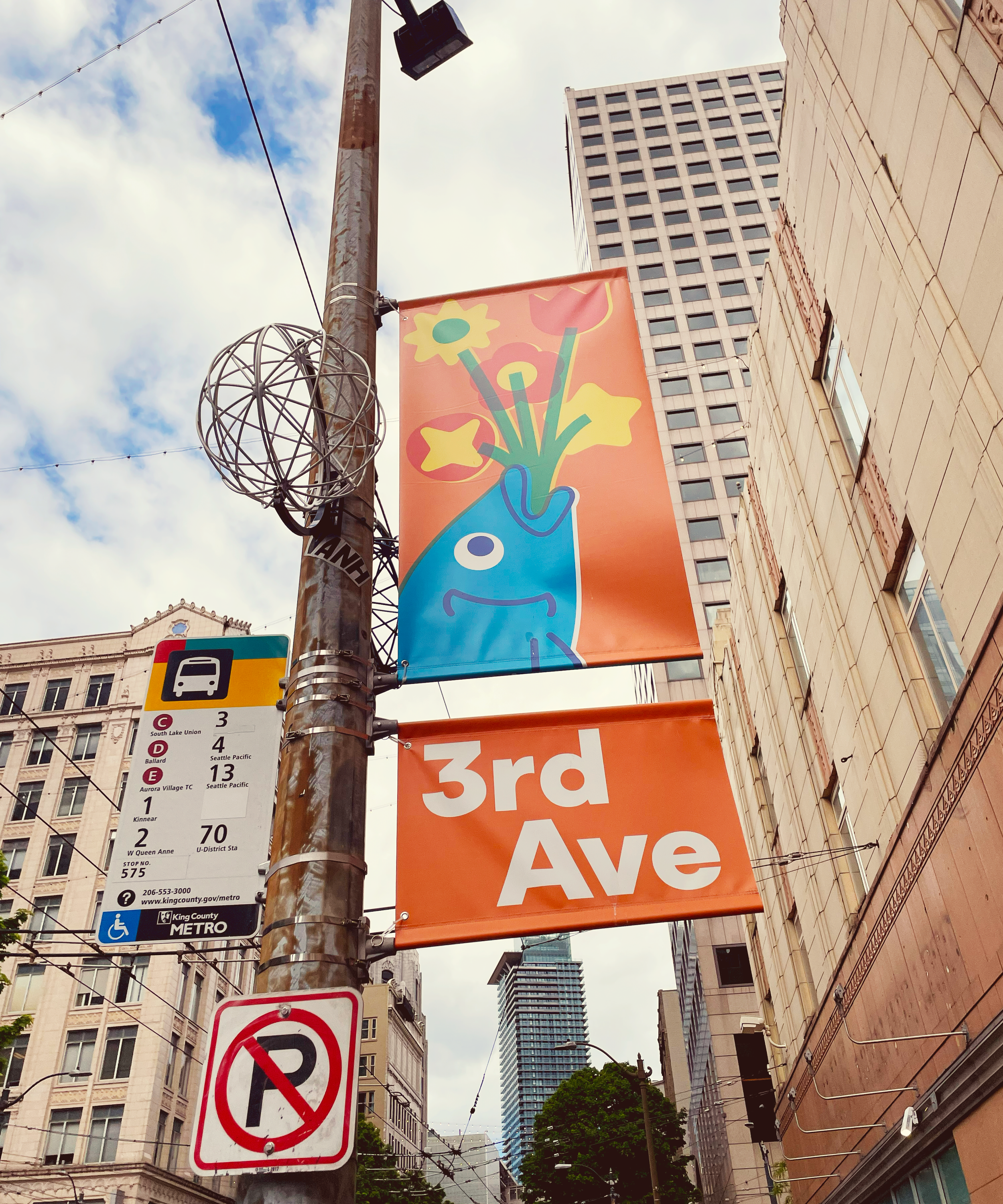
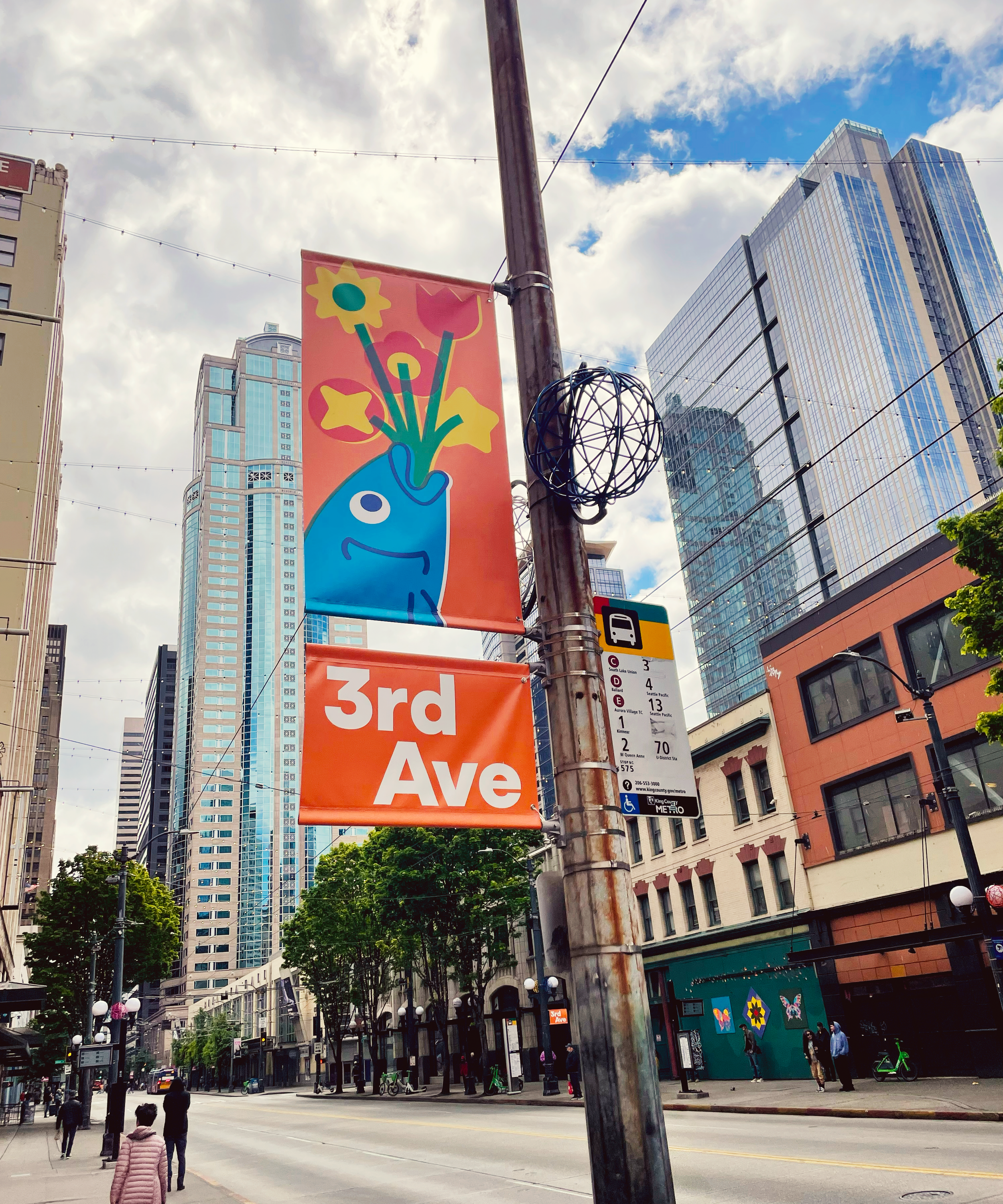
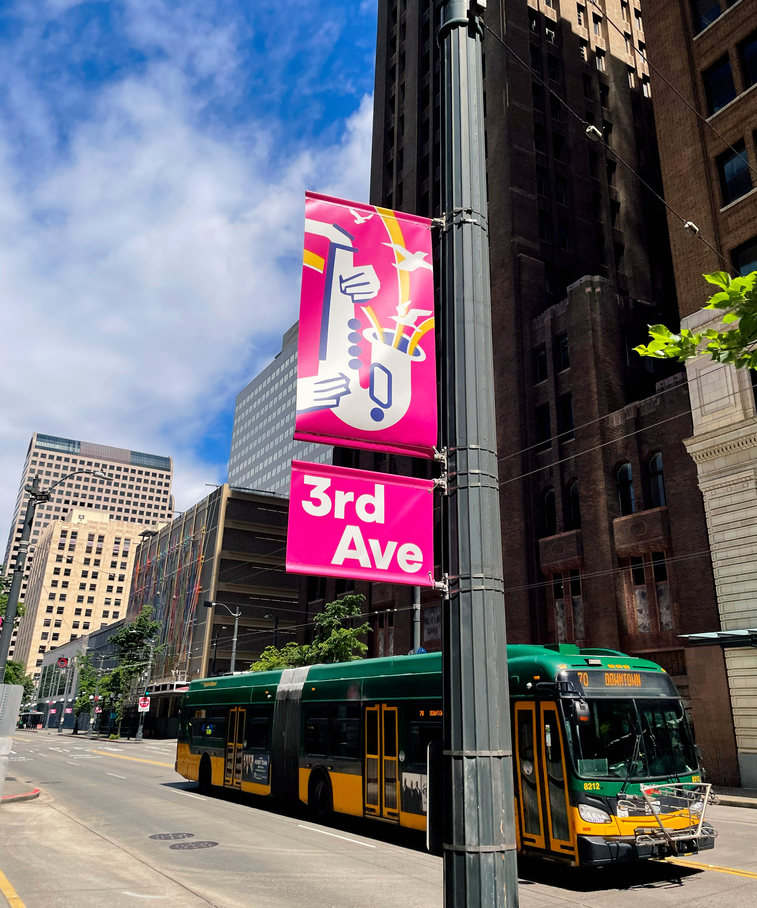
3rd avenue banners
Design, IllustratioN, & Creative ideation
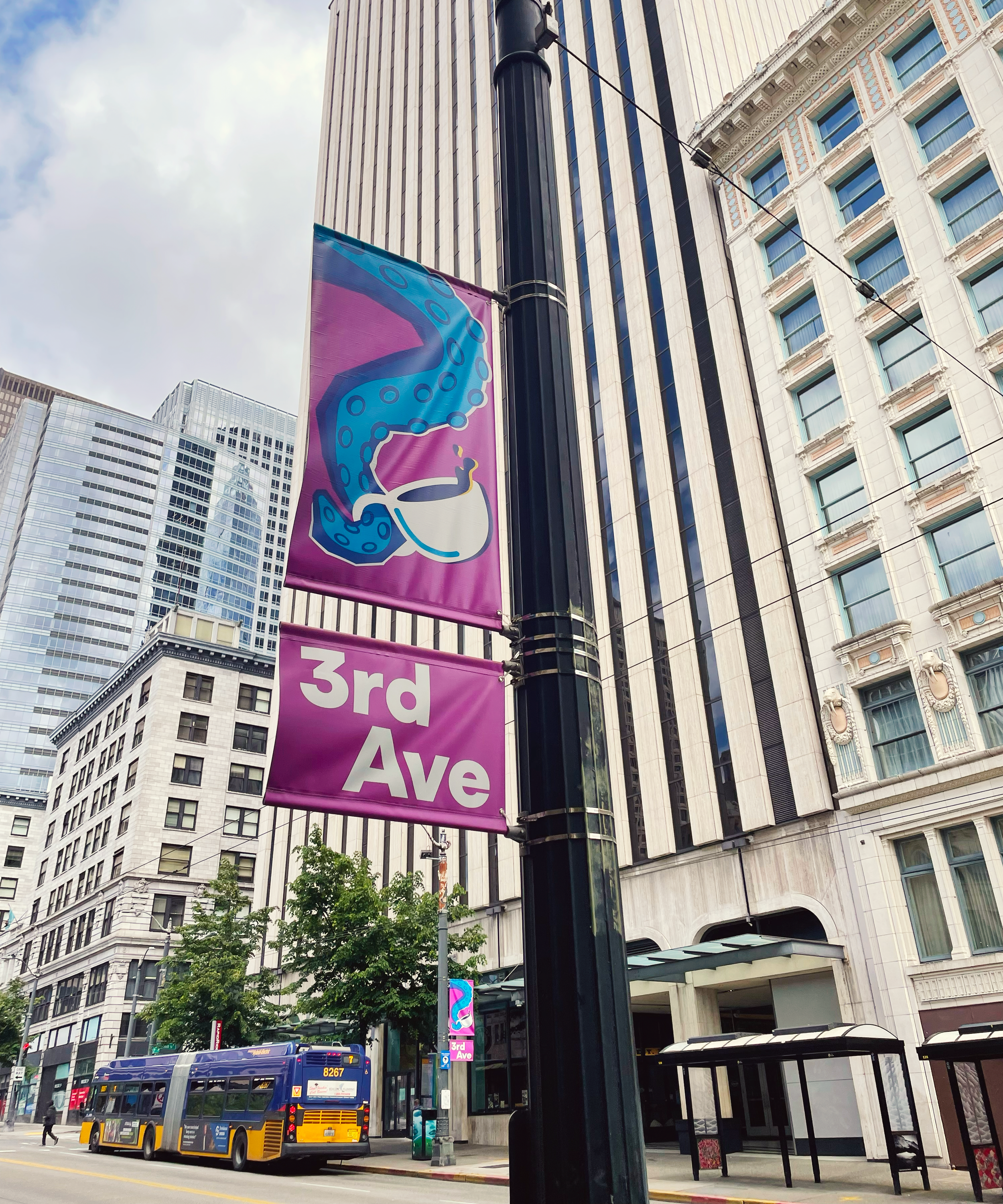
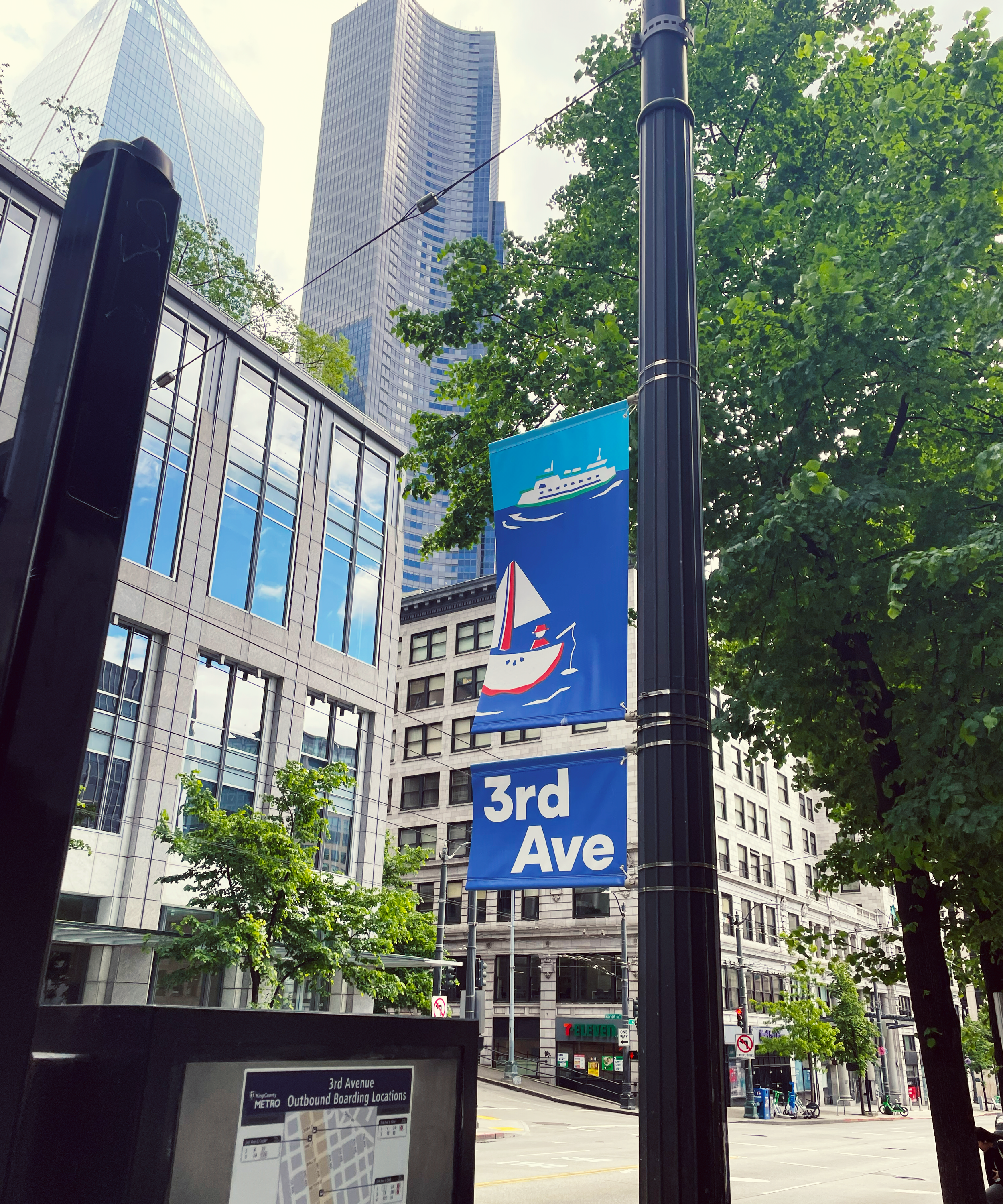
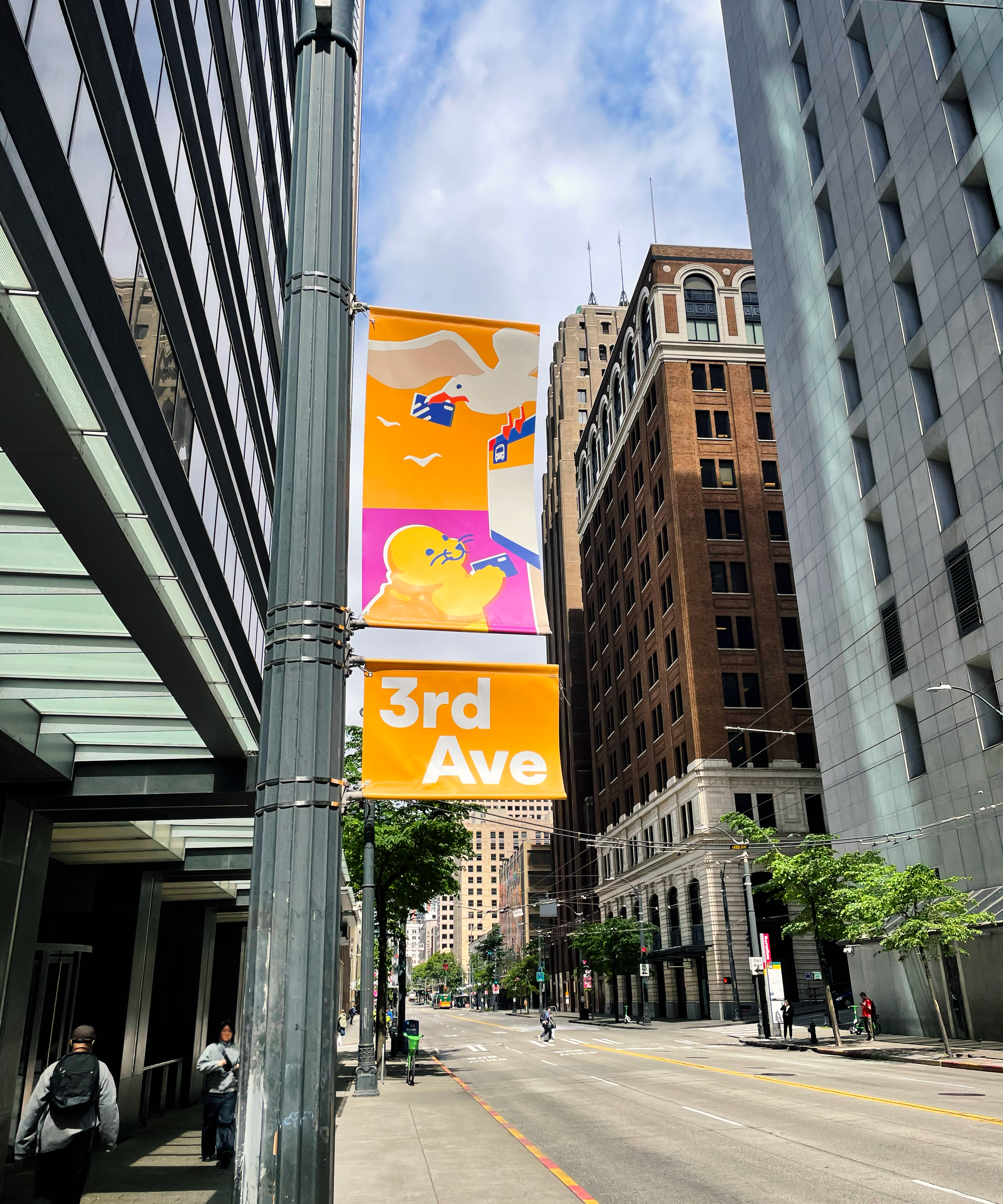
Through SDOT’s revitalization plans of Seattle’s 3rd Avenue, NBBJ’s Studio 07 was contacted to create a series of fun and colorful banners to liven up it’s environment.
The visual aesthetic of these banners focuses on referencing 3rd Ave and Seattle based cultural themes, with nods to vintage printing aesthetics.
Team members
Principal: Creative Direction & Ideation
eric
Levine
Senior Designer: Creative Direction & Ideation
Christina Sakura
Graphic Design Intern: Design, Illustration,
& Ideation
Cody Pham
My role had me jumping between different art styles and software programs to fully execute on what each concept wanted to convey. Iterations, sketches, and ideas would then be presented to my mentors during this project, where feedback would be given for further changes.
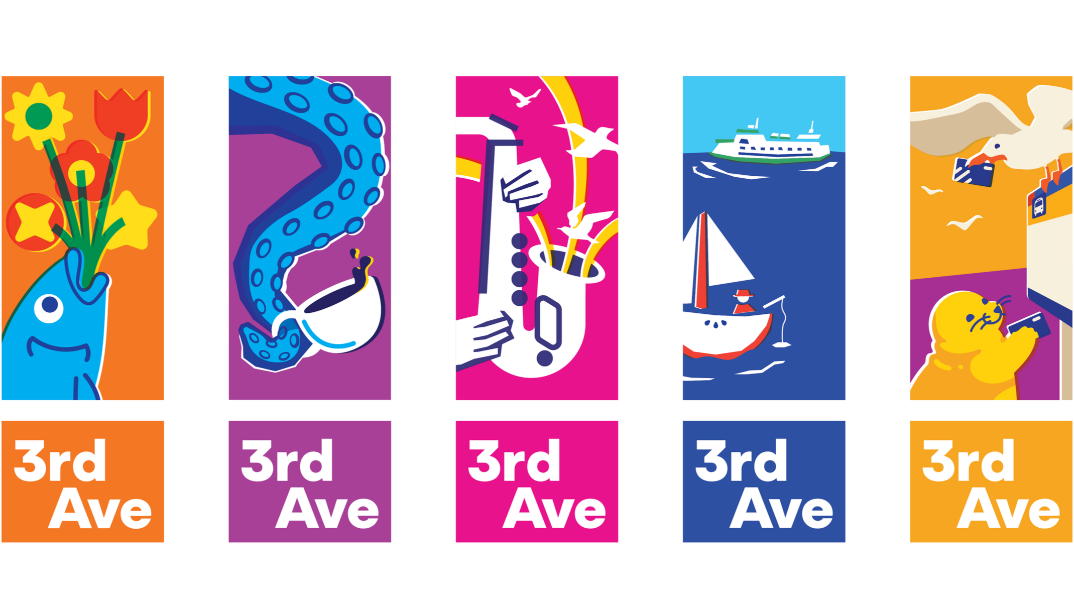
Banner Design Vectors
Process
Refinement and development was a huge core for this project, as the team went through macro and micro level refinements to make sure each banner design could stand on it’s own but also within a fully realized system.
Initially there were 4 concepts presented, (each with a top and bottom banner) to the client team before a final one was chosen for further exploration and development.

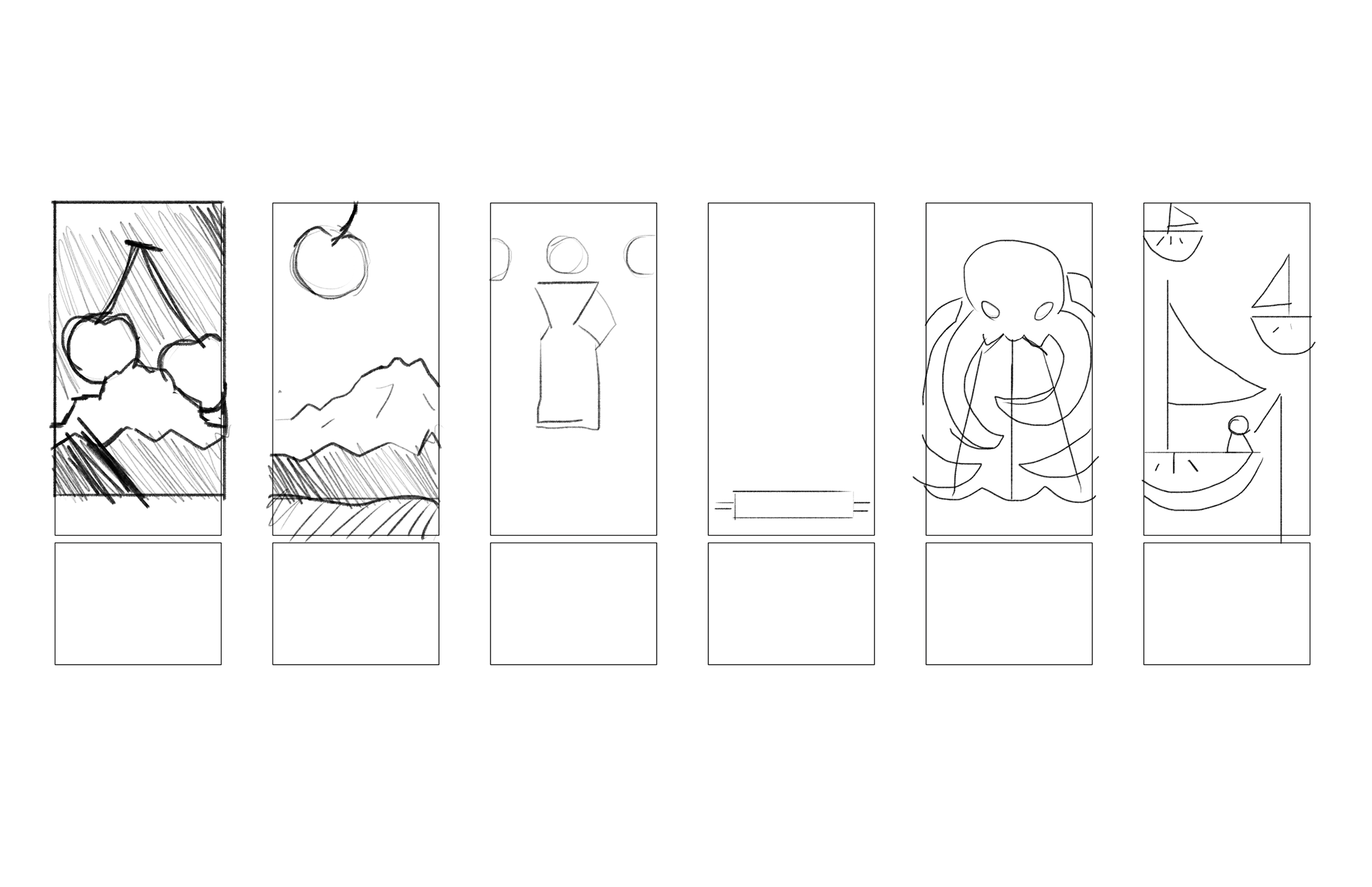
Rough sketching for banner content ideas.
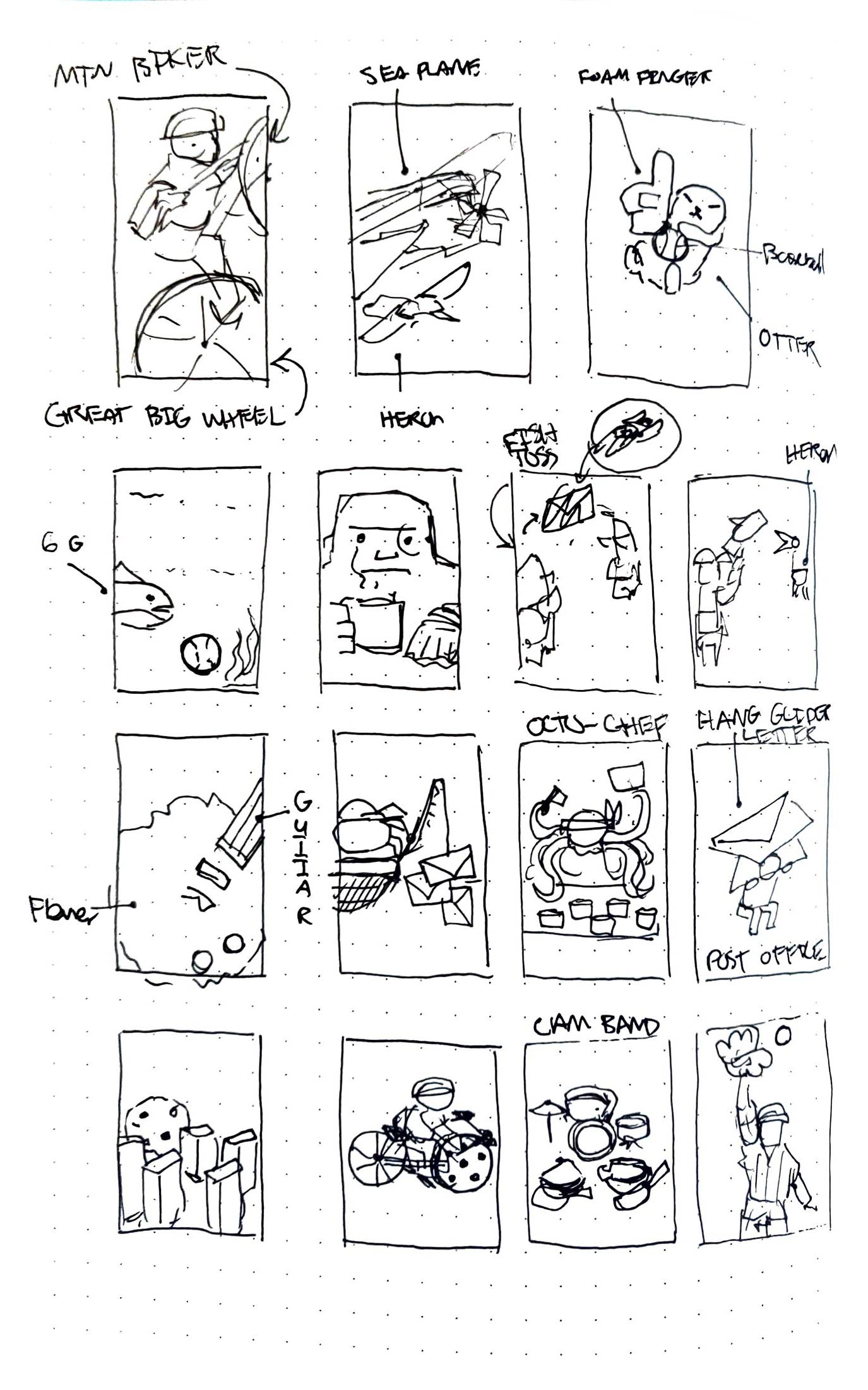
Idea drafts for incorporating and combining Seattle elements together.

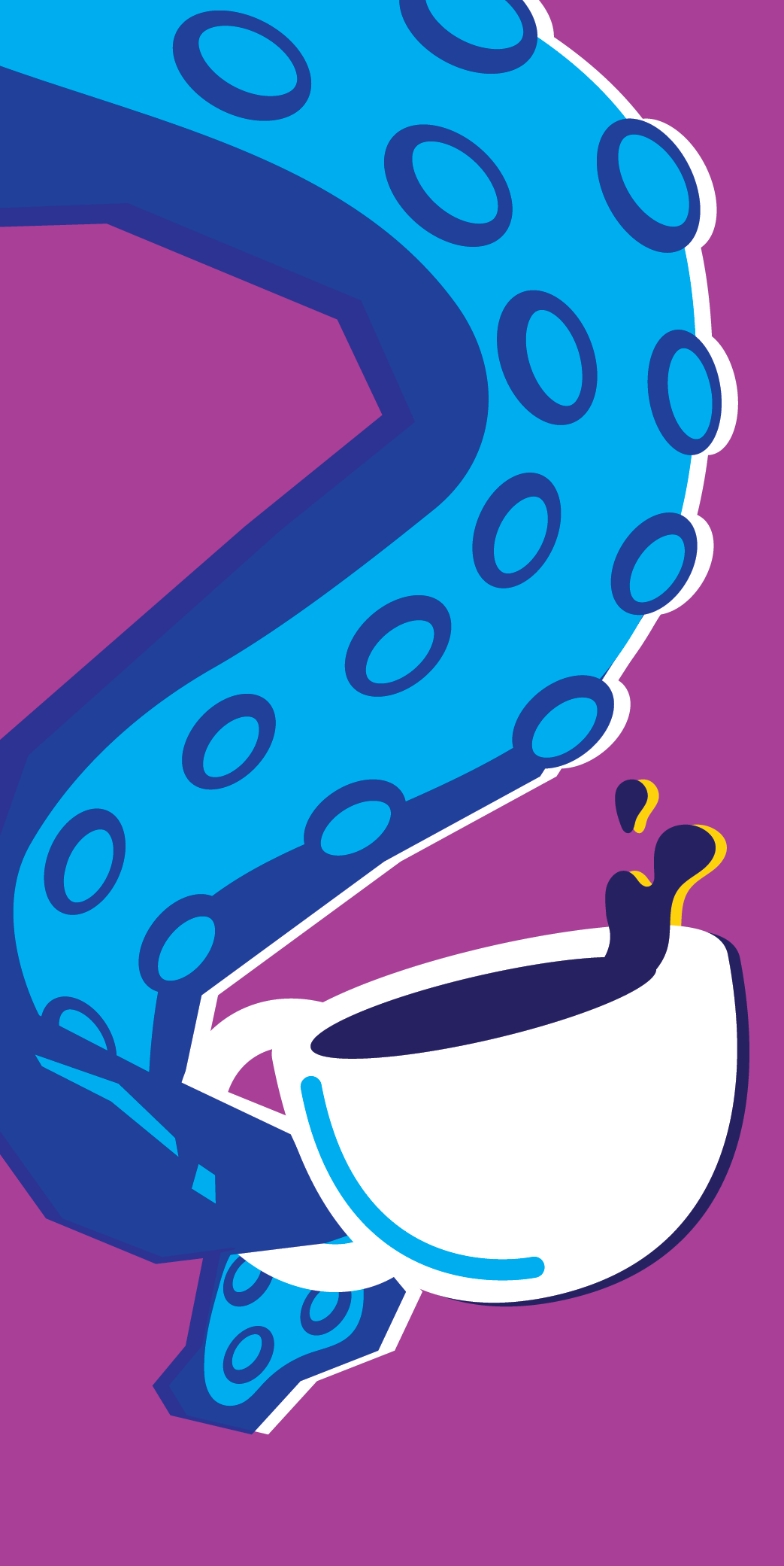
Initial sketches for the Kraken and Coffee Banner

Additional thumbnail sketches.
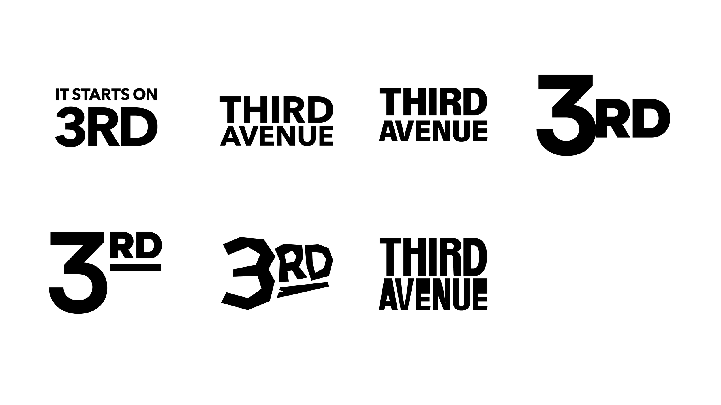
Bottom Banner Type Iterations
Direction 01: Collage
This direction focused on utilizing photos and collaging them together to creative whimsical and high-energy banners, combined with distinct and bright color palettes.
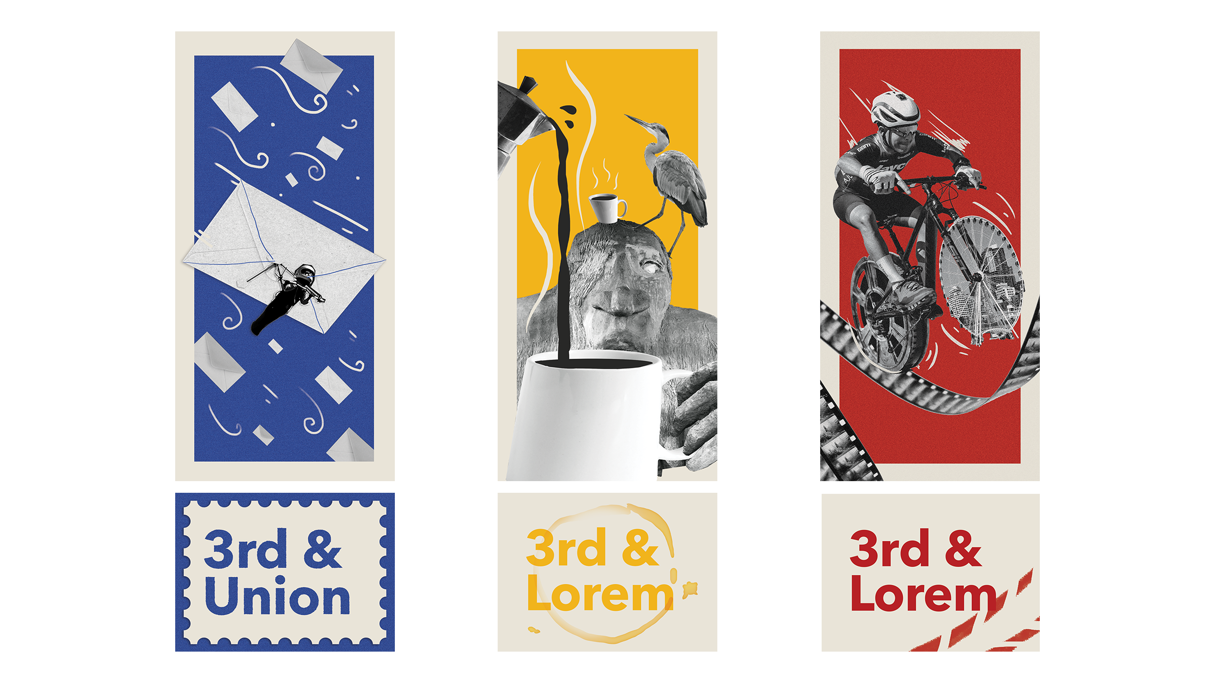
Direction 01 Initial Drafts
Direction 01 Second Drafts
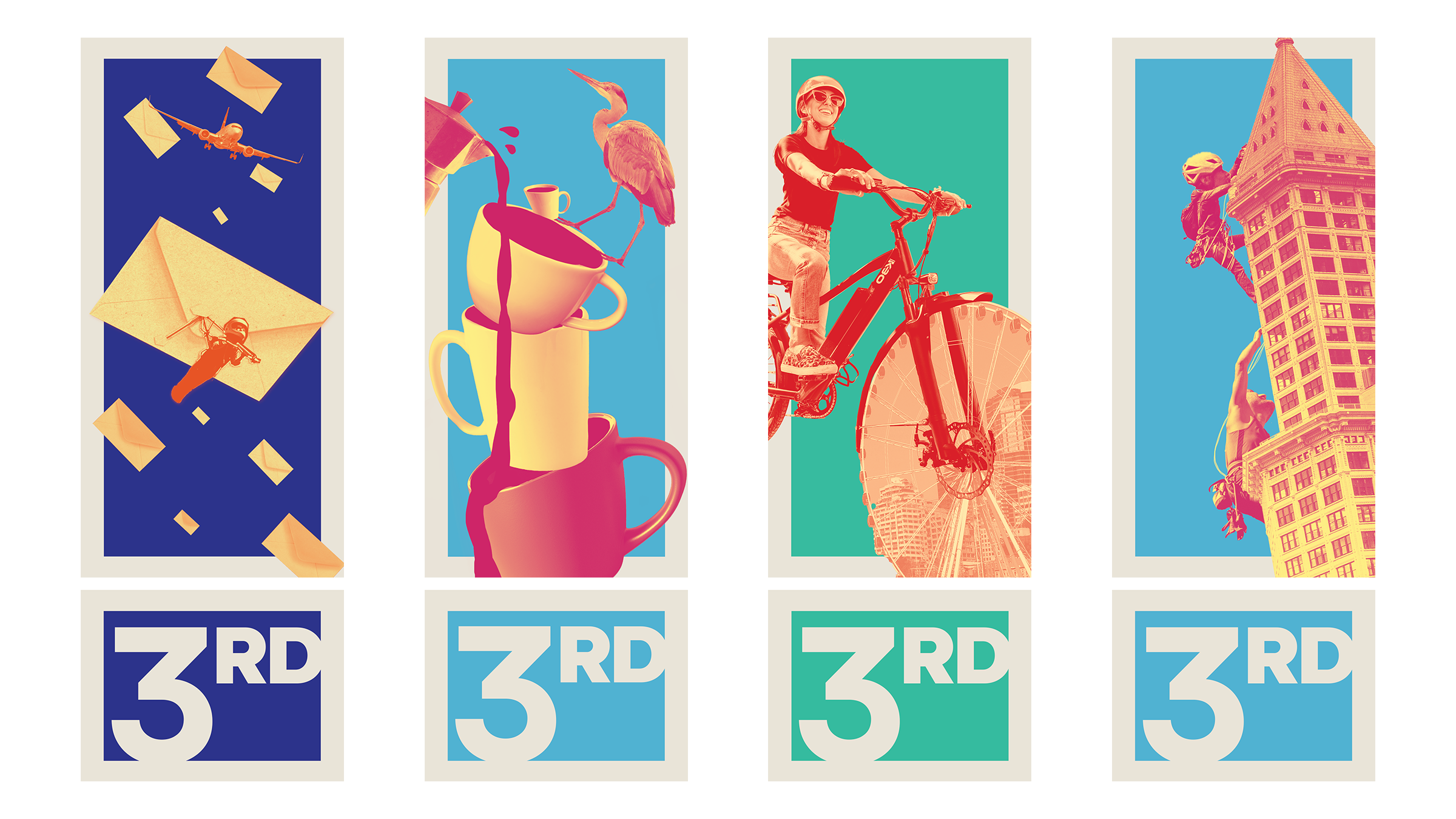
Direction 02: Cut
This pitch focused on creating a very modern and sleek tone for the banners, utilizing masking of real photography and a solid number 3 motif throughout.
Visual overlap between the photos was explored to create dynamic interest.
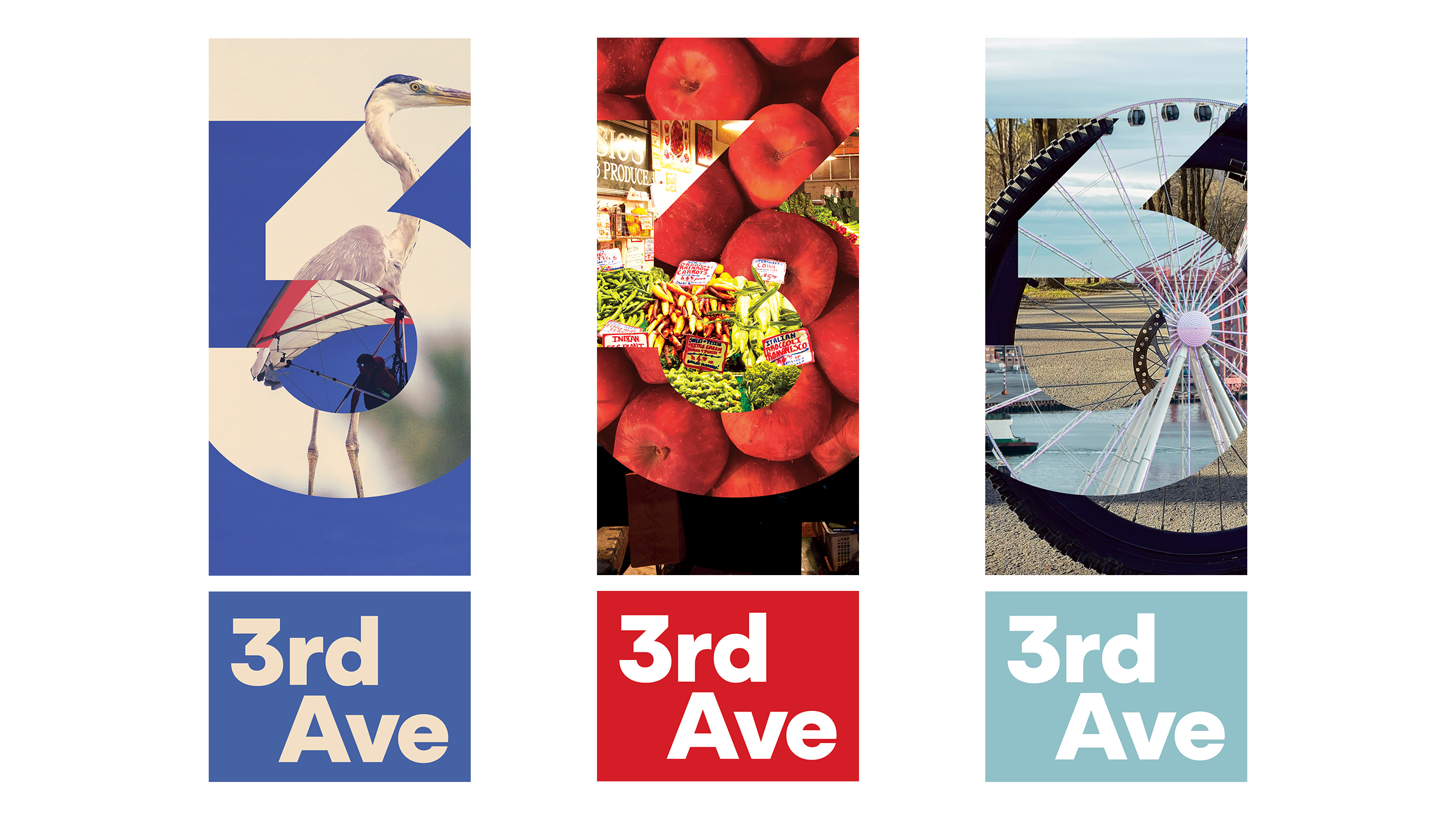
Direction 02 Drafts
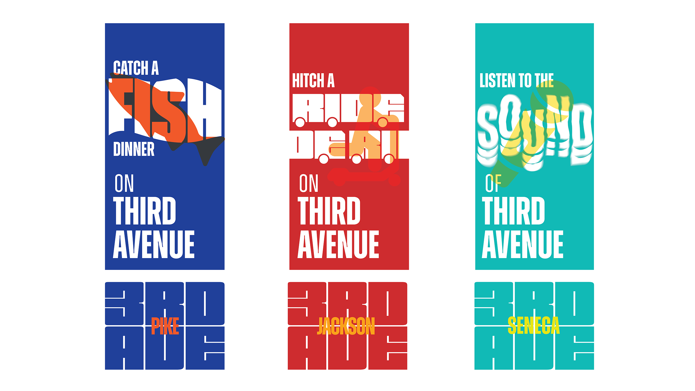
Direction 03: Type
This concept utilized typography to create statement visuals and phrases that articulated activities relevant to 3rd Ave. Visuals were overlapped to create a strong first impression while also being synergistic with the bold type presented.
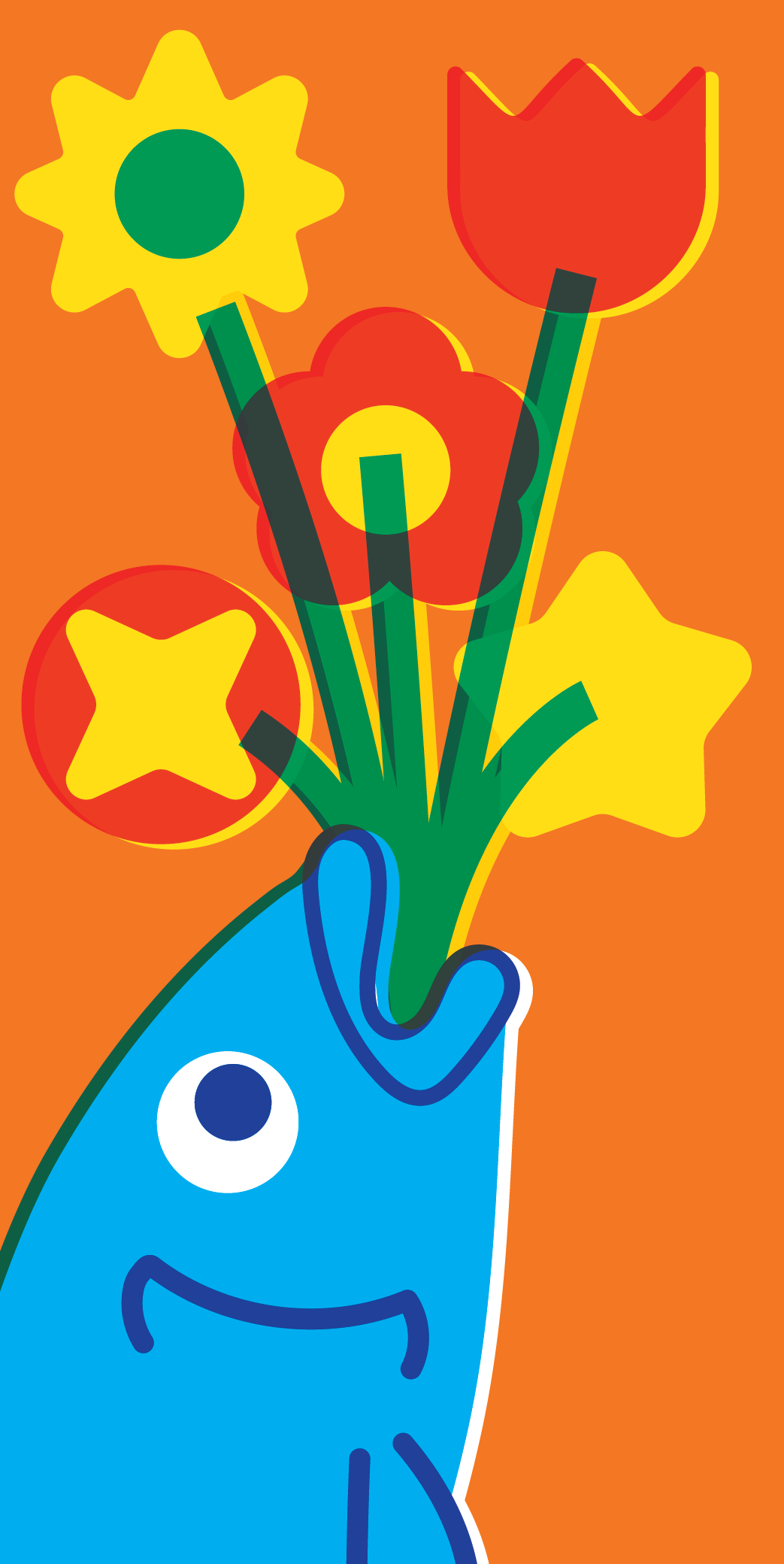
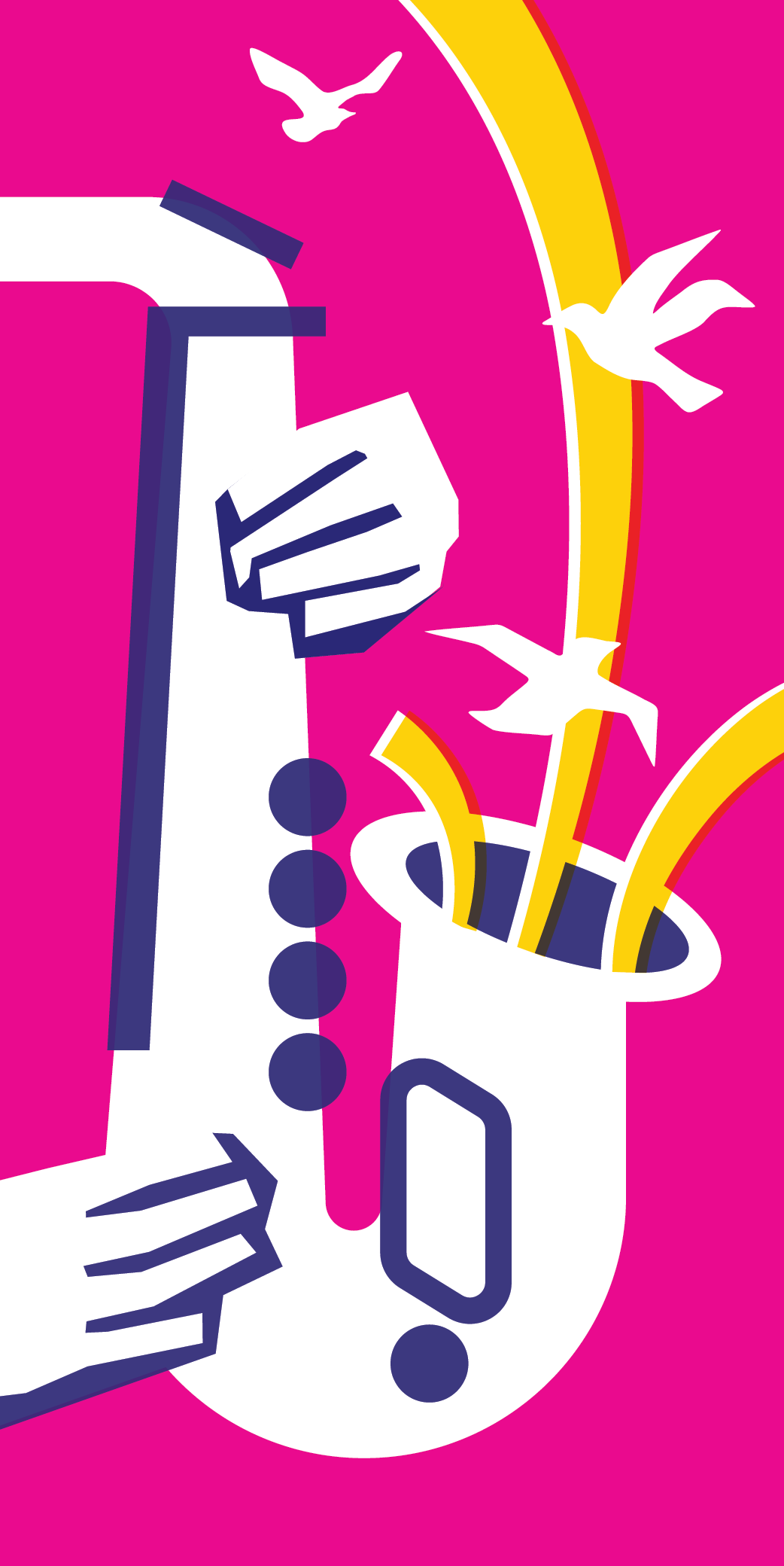
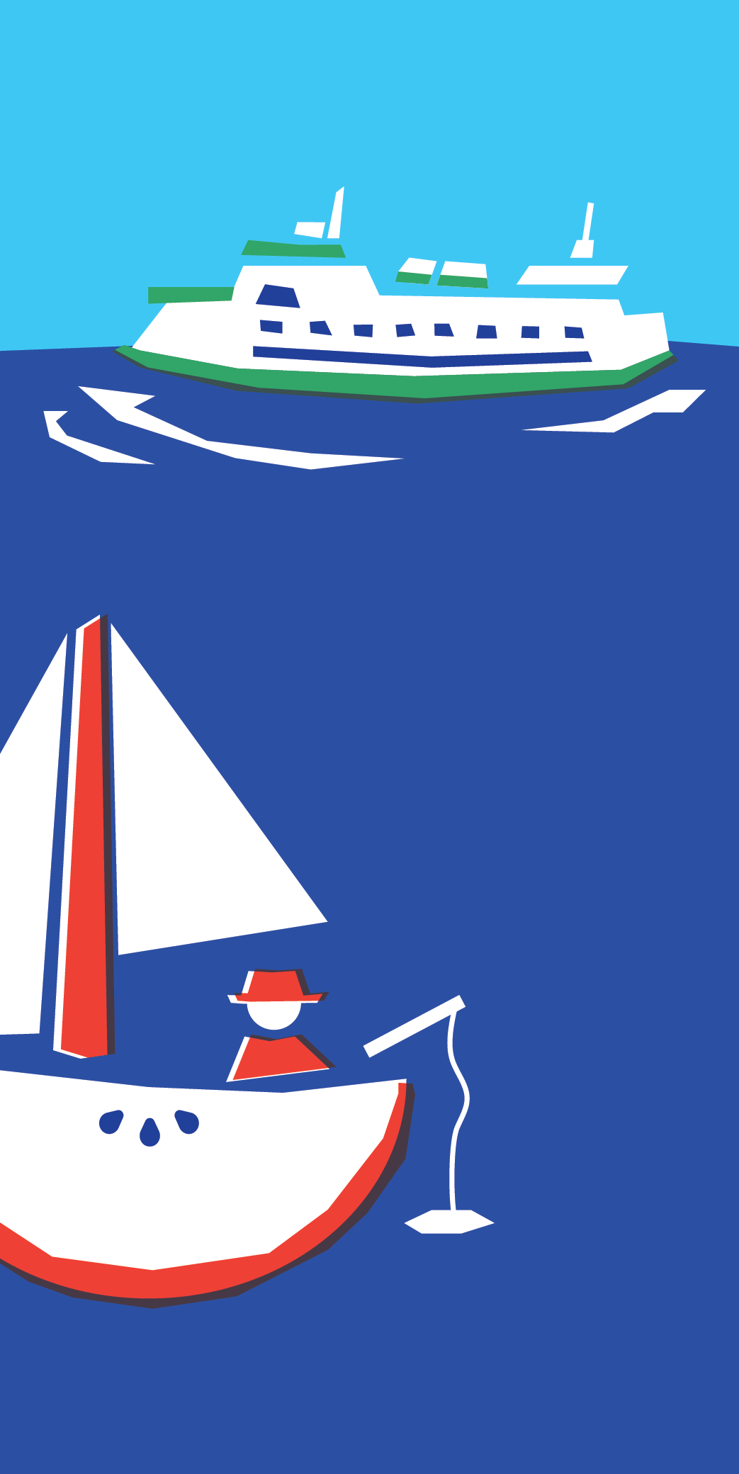
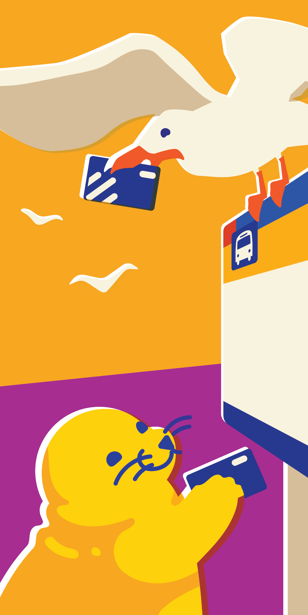
Direction 04: Vintage
Aiming for a timeless and light hearted aesthetic, the vintage direction calls back to old matchbox inspired art. Depicting Seattle focused activities with an added element of fun to each design. This was the finalized direction the client team approved for further refinement.

Ideation Sketches
Ideation Sketches

Seal Banner Sketch

Iteration of Apple Boat and Unused Concepts
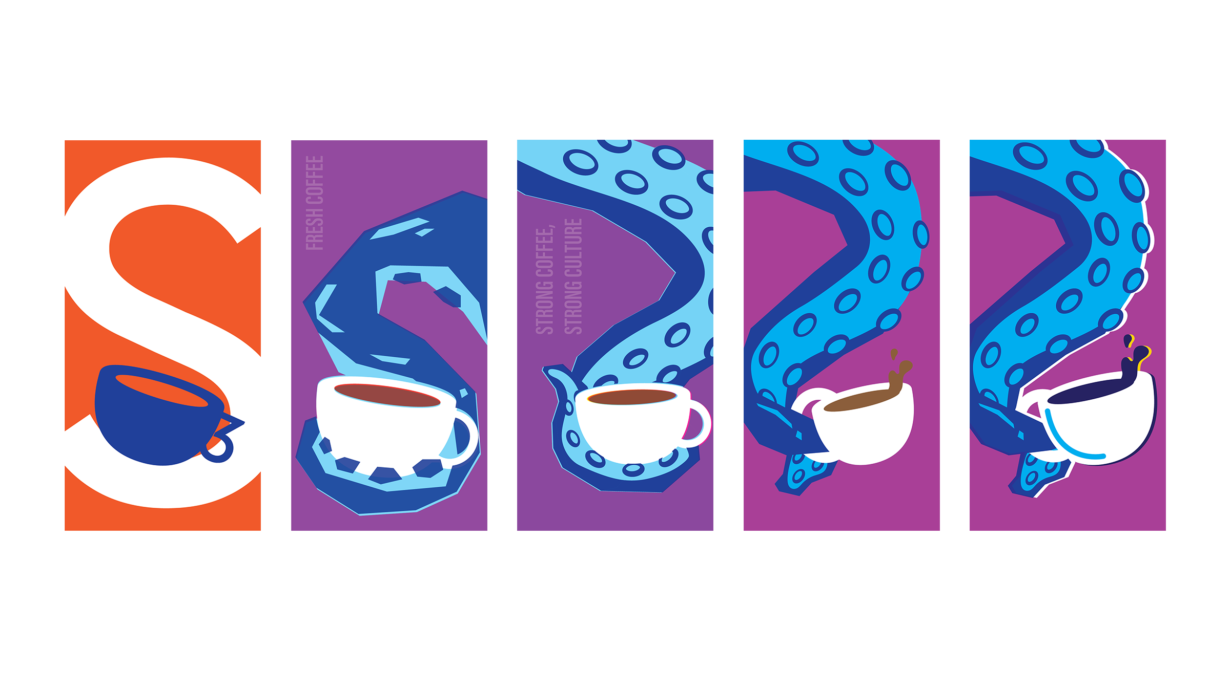
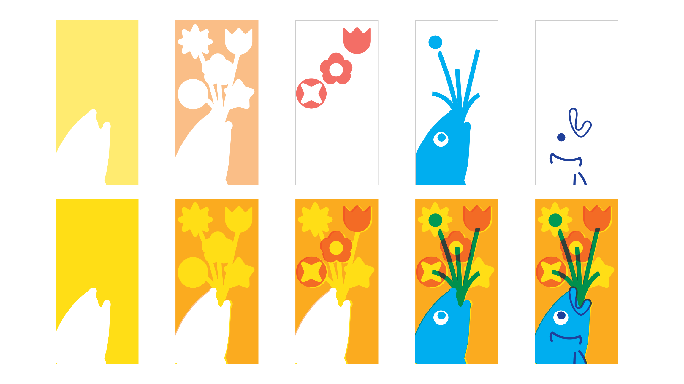
Kraken Coffee Banner Development
Digital Layering Process To Mimic Vintage Printing